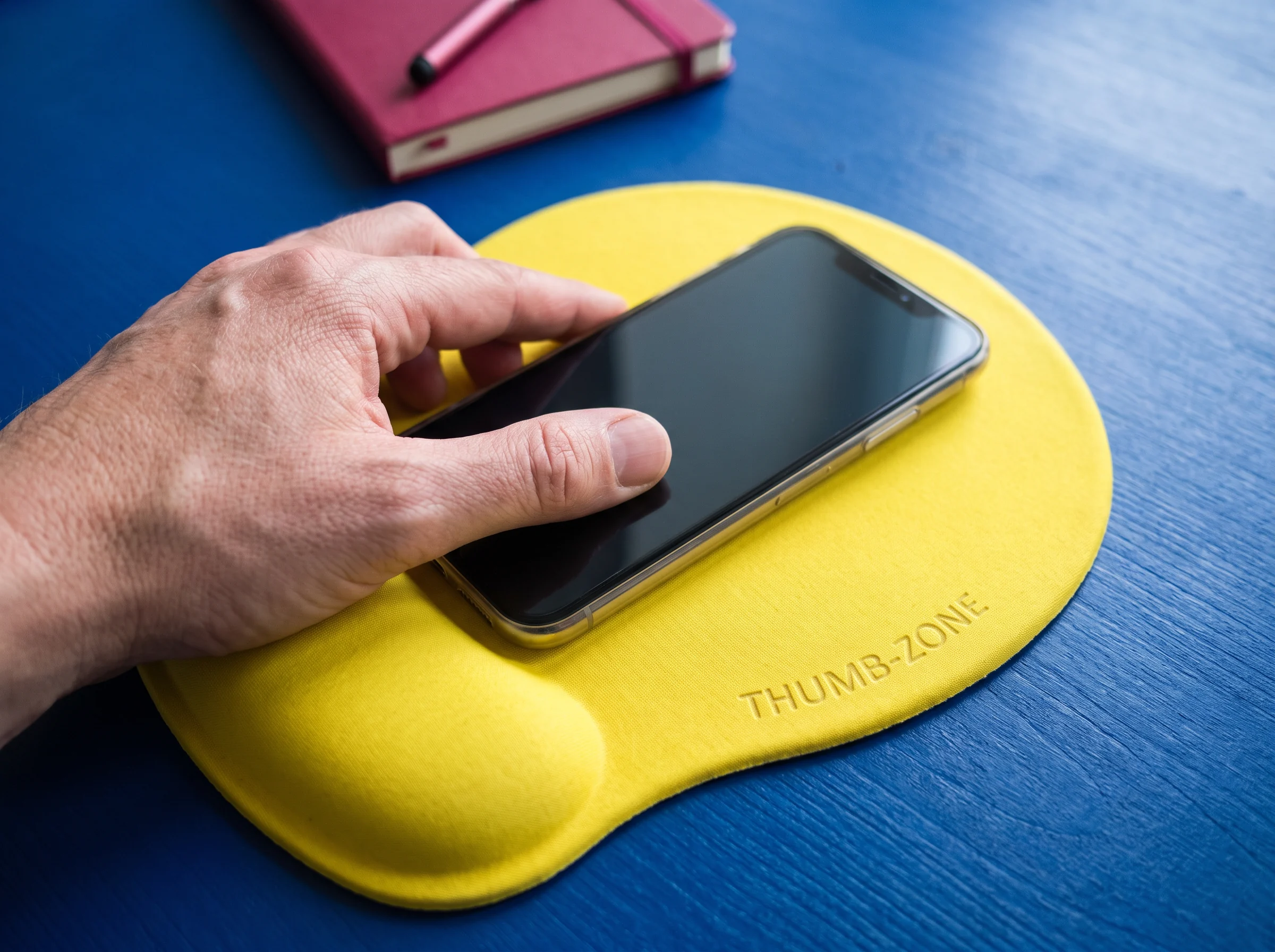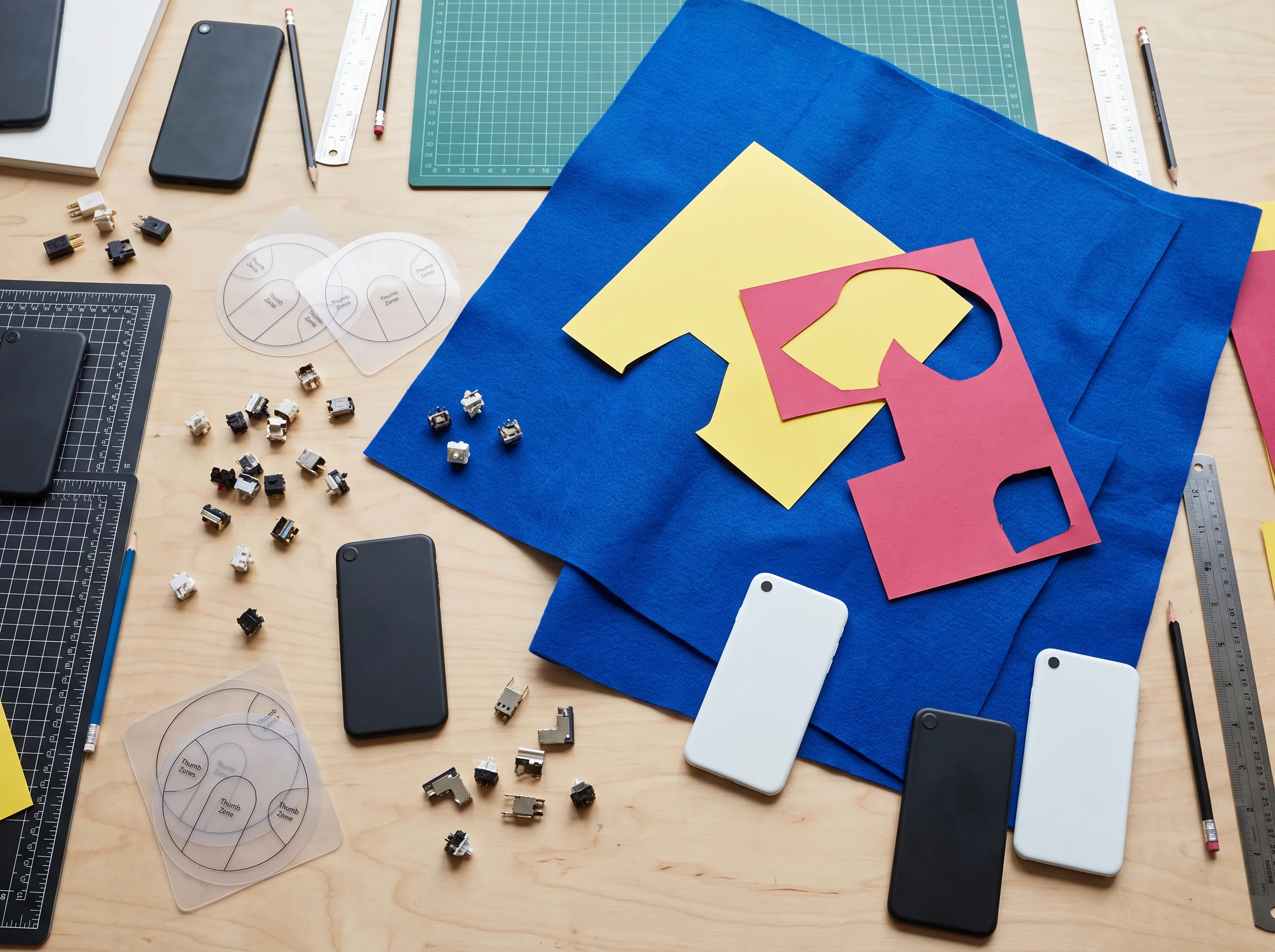
The frequent action belongs where the thumb can land without a grip change.
Use this zone for an action that returns often: confirm, advance, save a small decision, or move to the next item.
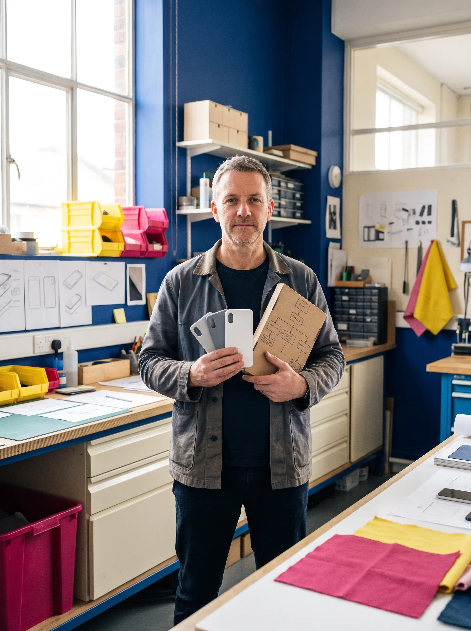
Pusedaro shapes the parts that make a mobile product feel natural in one hand: sequence, reach, visual weight, input, recovery and the small moments between them.
Bring a screen to the bench
Choose a zone on this rough handset map. The product-test entry changes so the conversation starts with a reachable decision, not a generic device frame.
Use this zone for an action that returns often: confirm, advance, save a small decision, or move to the next item.
A good mobile interface is not an inventory of patterns. It is a chain of choices about what stays visible, what waits, and what a person can do while standing, walking or switching context.
Give a person a clear way back after a choice, a detour or an interruption.
Preserve the cues that explain where a person was and why the next action matters.
When several actions compete, establish a deliberate order instead of a crowded row.

Spacing, contrast and placement can make a digital choice easier to locate by feel.
Every request deserves an understandable state: started, waiting, resolved, or ready to retry.
On a smaller screen, the answer is rarely “show nothing.” It is choosing the one piece of context that helps someone act now, and letting the rest wait nearby.
LIVE REACH CHECKWe use simple, focused prototypes to ask useful questions: can this action be found again, can the current state be understood, and what happens when attention breaks in the middle?
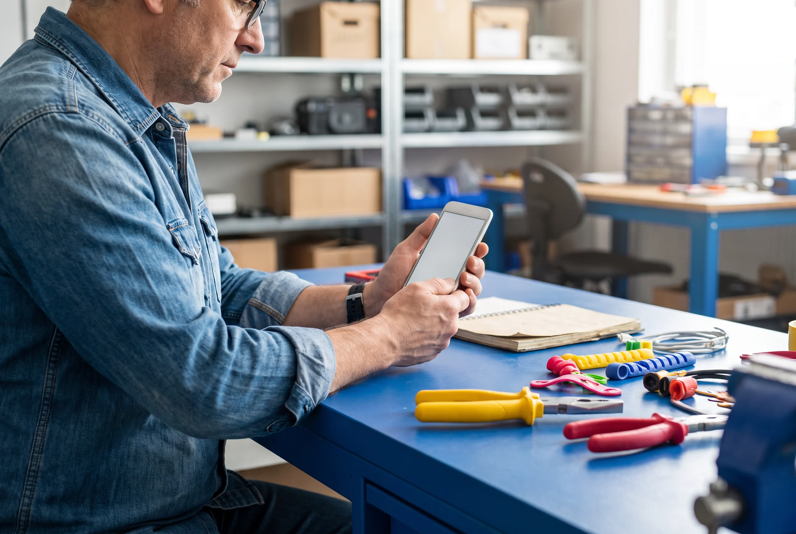
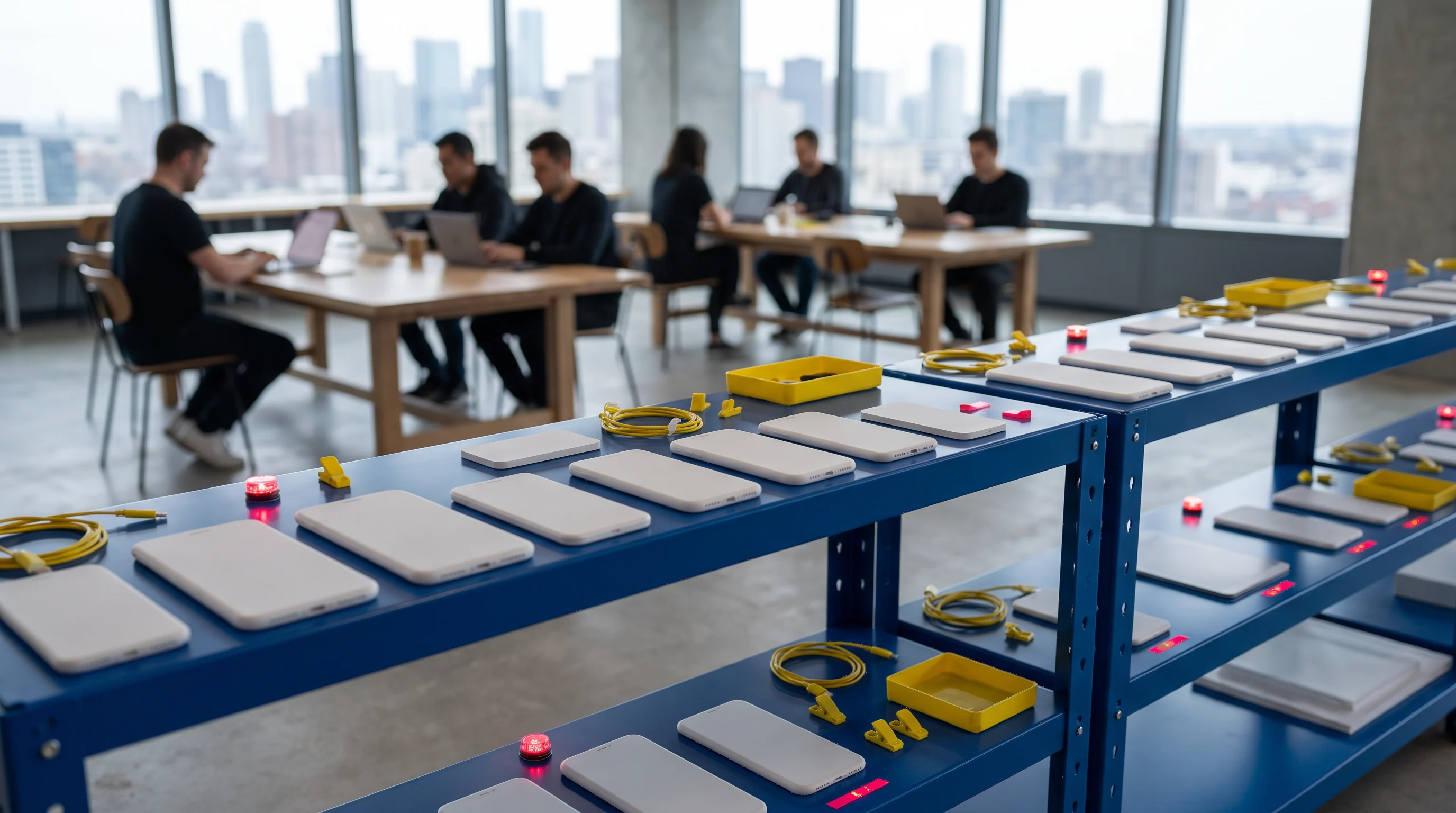
Different payloads need different handling. Each shelf label becomes a useful prompt for interface structure rather than a feature list.
Set down your payload
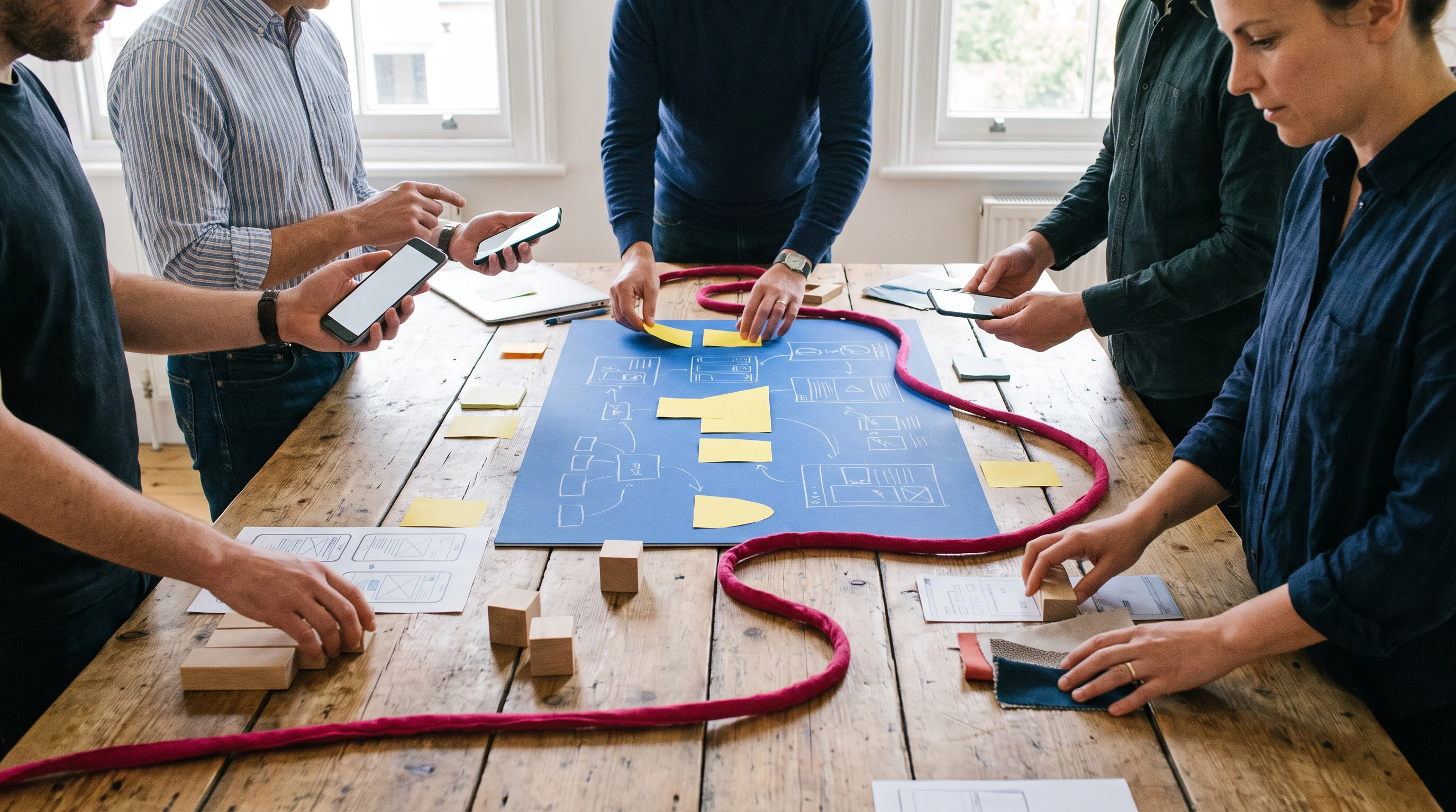
Key states, sequence changes, hand-offs and return points are assembled into a path people can follow without guessing.

We focus on a compact test prompt: a moment worth trying, a decision worth observing, and a clear note about what was learned.

Components become more useful when their states, labels and behavior are considered alongside the places they need to appear.

Words, empty states and confirmations are practical materials. They can orient a person just as much as a visual hierarchy can.
Physical making is a useful way to inspect a digital screen. A surface, a control and a prompt may occupy the same interface, but they play very different roles in a person’s hand.
Reserve a calm plane for the information that lets a person orient before choosing.

Make the moment that changes something easy to identify and hard to confuse with a nearby option.
Show the product’s answer in the same visual neighborhood as the request that produced it.
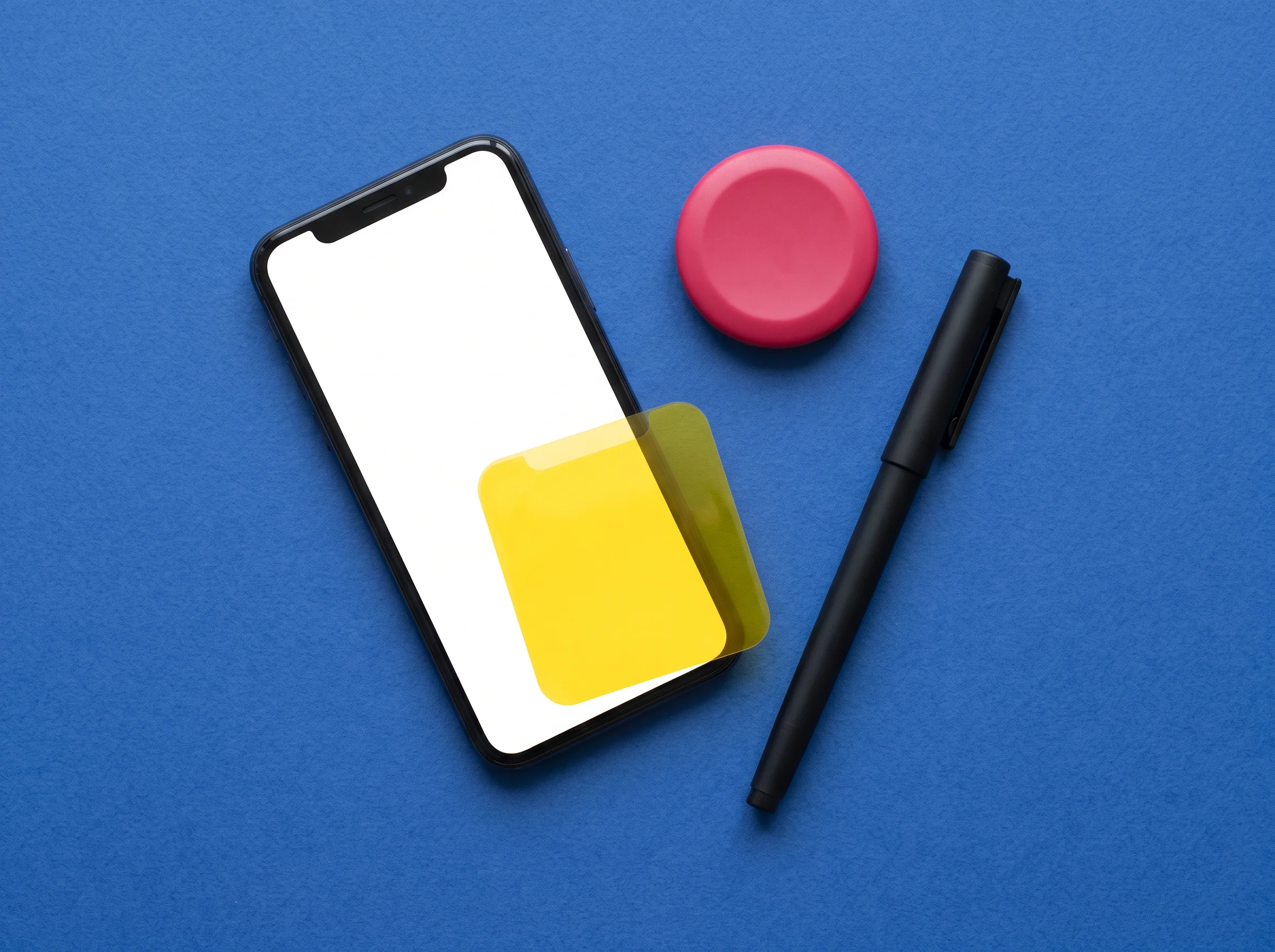
ANNOTATED OBJECTS / SURFACE · ACTION · RESPONSE
Bring the immediate action into reach, then state what it will affect before the person commits.
Keep the item, place or stage visible enough that a person does not have to reconstruct it from memory.
A compact, specific state lets the screen acknowledge a request without pretending the work has already finished.
When something cannot proceed, name the condition and offer the most useful direction from that exact point.
Try the important action several times from an imperfect grip. Look for the moment attention or reach slips.
After the action, can the product’s state be understood without scanning the whole screen?
Mobile work asks for restraint, not disappearance. We arrange the most useful evidence around the immediate task and give supporting detail a deliberate place to return to.
CONTEXT DOES NOT MEAN CLUTTERBring a flow that needs attention, a screen that needs a second reading, or an early product question. We will start with the hand, the situation and the next understandable step.
Start at the workbench
Four concise starting points for teams considering a focused mobile interface engagement.
Pusedaro is suited to focused mobile product questions: a task that is hard to complete in one hand, a flow that loses its context, an action whose result is unclear, or a compact interface that needs a more deliberate structure. The workshop can contribute product thinking, interaction direction, interface patterns, prototype material and practical language around a clearly defined problem.
No. An existing system can be useful source material, but it is not a prerequisite. An early product description, a rough flow, screenshots, research notes or even a carefully stated uncertainty can be enough to begin a useful conversation. The important part is being clear about the situation a person is in and the decision the interface needs to support.
It provides a productive constraint rather than a visual style. One-hand use makes reach, sequencing, grip changes, interruption and feedback concrete. Instead of treating a screen as a flat composition, we can examine how a person locates an action, commits to it, receives a response and finds their place again. That perspective often reveals small changes with meaningful practical effects.
Please include a short description of the product situation, the audience or user role involved, and the specific mobile moment that needs attention. Links, screenshots and reference material are welcome when they help explain the current state, but they are optional. A useful note also says what you hope will be clearer after the work: an interface direction, a tested flow, a decision framework or a more coherent set of next steps.